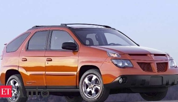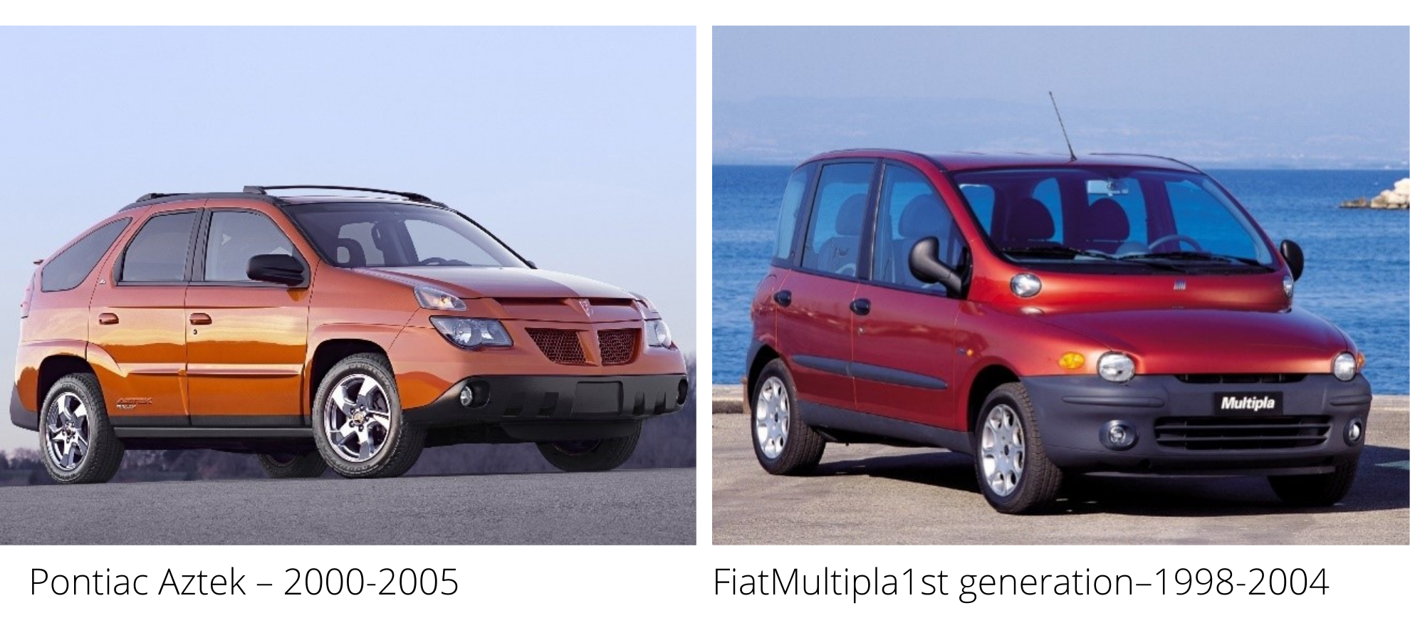
When the restyled Hyundai Creta was launched in 2020, I was reminded of the Pontiac Aztek. The styling of the Aztek had struck me when I first saw it in flesh-and-blood in 2006. Almost the same feeling when I saw the Fiat Multipla the same year. These two vehicles caught global attention, albeit for the wrong reasons at the turn of the millennium!
The Aztek that did not last more than five years of production in the US and the first-generation Fiat Multipla lasted for one year more.I quite liked the quirkiness of the Multipla. Both were extremely capable vehicles with interesting interior layouts, including flexible seating for six in the Multipla and loads of interior space. Both were practical inside, but the outside let them down totally.
Automotive journalist Dan Neil called the Aztek one of the 50 worst cars of all time and said it “violated one of the principal rules of car design: We like cars that look like us. With its multiple eyes and supernumerary nostrils, the Aztek looks deformed and scary, something that dogs bark at and cathedrals employs to ring bells. The shame is, under all that ugliness, there was a useful, competent crossover.”
The Fiat Multipla actually won the Top Gear Car of the Year in2000, as well as the “Ugliest Car” in the same programme’s awards. It was voted BBC Top Gear’s “Family Car of the Year” for four years in a row, from 2001 to 2004. Yet, The Daily Telegraph placed it #2 on its list of the “100 Ugliest Cars” in August 2008, with the #1 slot going to the Aztek!
Cut to 2021
When I see vehicles around me, I find some eerie similarities in styling with both the vehicles! Blasphemous? Not in the least, for both could have been much ahead of their times.
Vehicles across segments are looking more similar to each other than before. If you take away the logos on the front grille and place them side by side, it would be difficult to identify most of them. That is why the logos are getting bigger by the day, I presume!
Some that have a specific design DNA will always stand out yet there are certain elements that are carried through a wide spectrum of vehicles, across markets and segments. If one styling feature or cue becomes popular, sadly most automakers make a beeline for the same. I can understand this for features and performance parameters, but to adopt styling cues brazenly from vehicles with completely different DNAs raises questions on the very ethos and ethics being established in the world of design today.
I reached out to four people who have a deep understanding, experience and expertise about the world of vehicle design: –
- Ivo Groen, Head of Creative Design, Lynk & Co. [part of Geely]
- Gautam Sen, celebrated columnist and author of books on automobile design
- Xavier de la Chapelle, founder of independent French car maker De la Chapelle
- Adil Jal Darukhanawala, a leading Indian automobile journalist and author
Are vehicle designs similar or distinct?
All the four lament and agree with me that there are increasing levels of similarity in vehicle designs, more so in specific body styles like SUVs. Gautam Sen clarifies that “a few though are more distinctive, but they are the rarer ones”. Adil goes on to explain, “Strikingly detailed may not be evergreen, whereas evergreen and pleasing cannot be harsh and striking!”
Is the similarity an outcome of regulations & technologies or are brands playing it safe?
Both, according to all the four. While safety regulations and aspects like ADAS do lead to certain curtailment of the pencil’s flair, it is also the security of replicating and incorporating typical items that are ‘popular’ that lead to lack of distinction. It is as if the automaker is trying to appeal to the entire world with a single piece of design. If this principle does not work in other product categories, including architecture and fashion apparel, how can it work in the passenger car?
“The better solutions to the regulatory and technology-driven impact on the design (i.e. passive and active safety, integration of ADAS, etc), are often copied by others, sometimes without knowing the exact reason,” comments Ivo. Gautam Sen explains, “It’s more a case of dictates of fashion – certain treatments and features become more fashionable during a certain period, and most tend to follow that fashion, as it is safer.”
In his typically brutal candidness Adil says, “Even then there are exceptions to this statement but here is where the brands, or clearer still, the bean counters come into play, often with disastrous results.
Trying to save INR 500.00 per unit on what will delight certainly will cost tremendously in sales and aura more than one can imagine and here the onus is on trying to be driven by leadership across the spectrum than just to maintain bottom lines on balance sheets.
”Xavier concurs in his calm style with Adil and comments, “Yes, regulations & technologies and also, of course, to play it safe and avoid too big marketing risks due to huge R&D investments…”
What are the elements of similarity or homogeneity?
Given the regulations, constraints and compulsions that designers work under, I have worked out two distinct “formulae” that are applied by most automakers to their vehicles.
Formula #1: The front styling combo – eyebrow DRL + split headlamp + faux air intake + dollops of chrome on the grille + BIG logo!
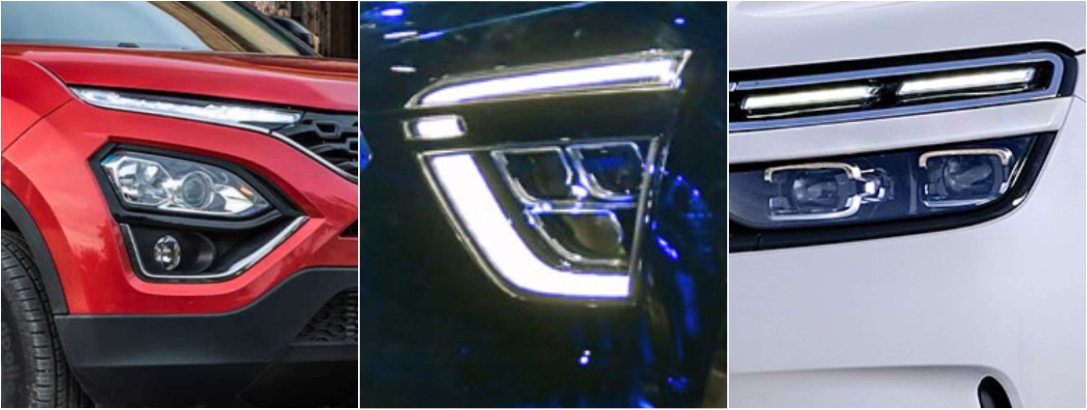
Look at the split DRL and headlamps across three distinct vehicles offered in India right now. Who inspires whom? Was the Aztek really that hideous?
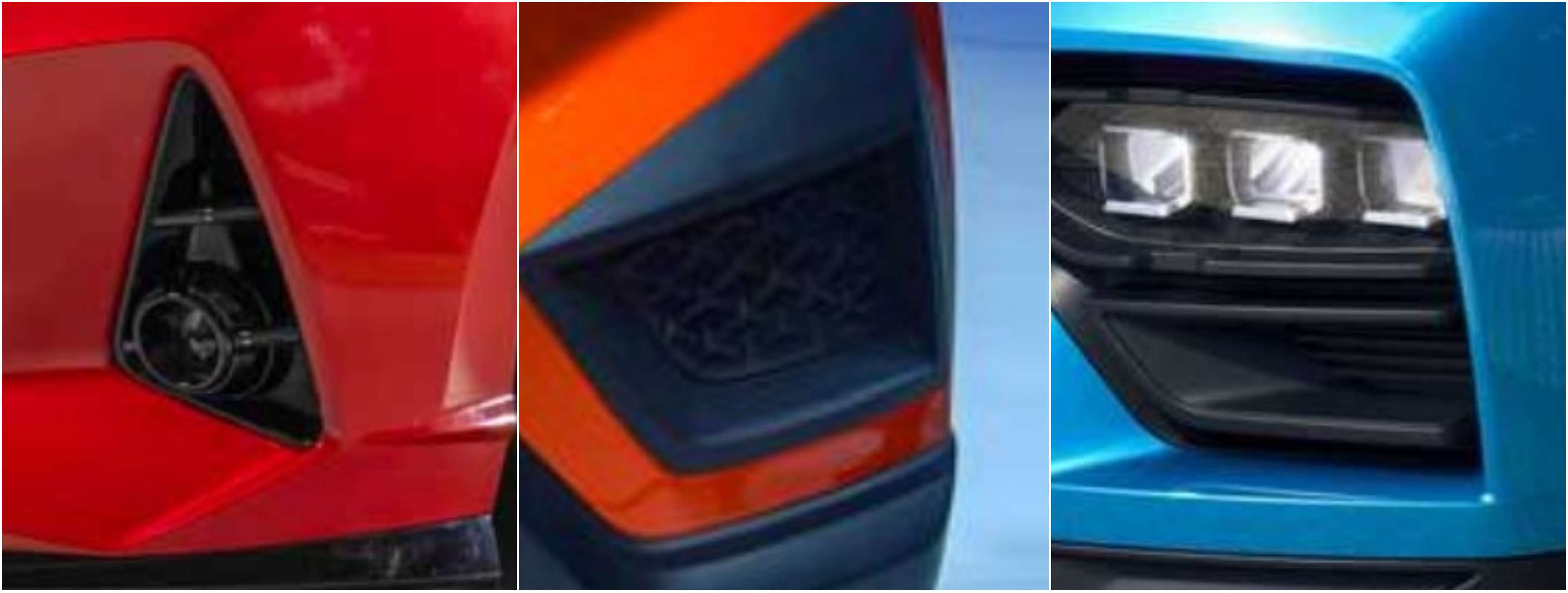
Faux air intakes – everyone has to have them irrespective of whether they gel with the overall design! Since the Spada Codatronca of 2008, we have seen some of the biggest luxury and ultra-performance brands also copying the front air intake design!
Then we have those ‘blingy’ front grilles with chrome in different shapes and sizes…dots, stars, arrows, ovals, waterdrops, trapezoids…think of a shape and you will find a corresponding grille. And right in the middle of those grilles are the logos…big, in chrome, and sometimes even lit from behind! I believe it is the lack of clear differentiation when viewed from a distance that makes an automaker rely upon a huge logo that makes it easy to be identified.
Formula #2: The rear styling combo – blacked out C-pillar + floating roof + shark-fin antenna
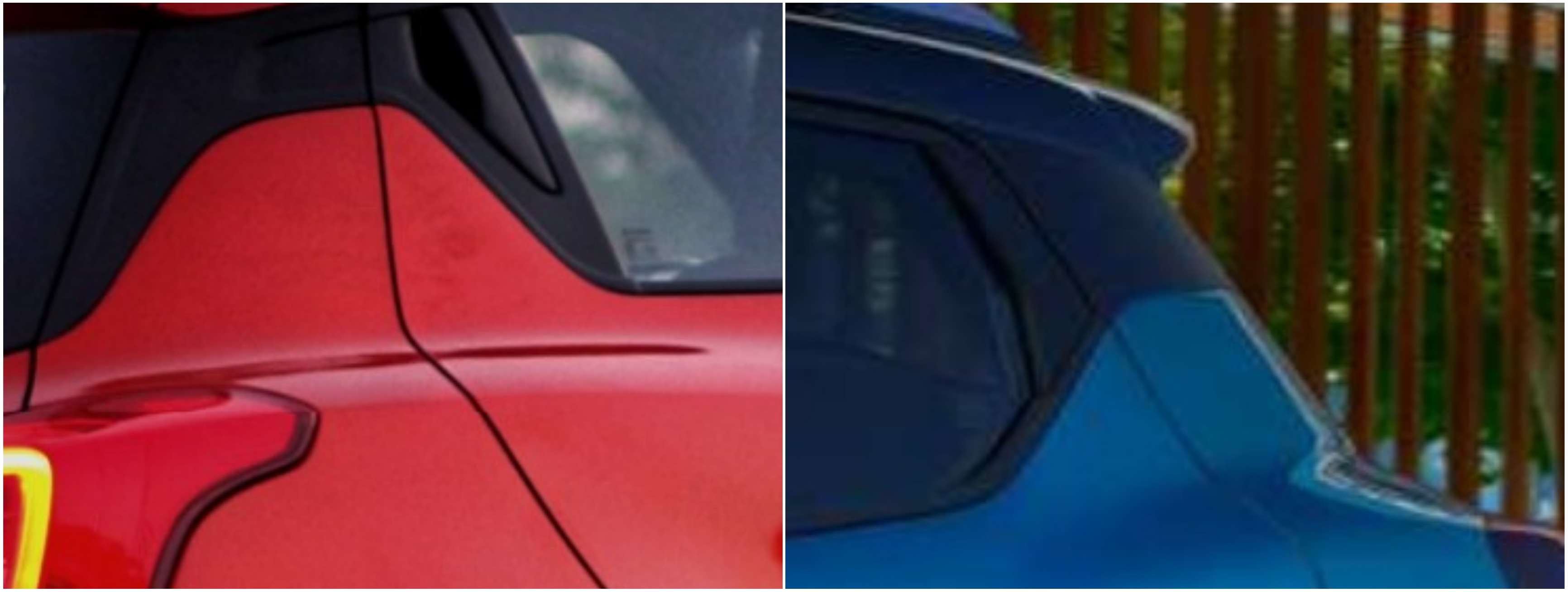
These are not two vehicles from a single brand sporting a ‘family’ look, but actually from two competing brands, in different segments altogether. This is one example of the formula being applied. Just like the shark-fin antenna that goes with a low-slung sedan but is also seen on compact SUVs!
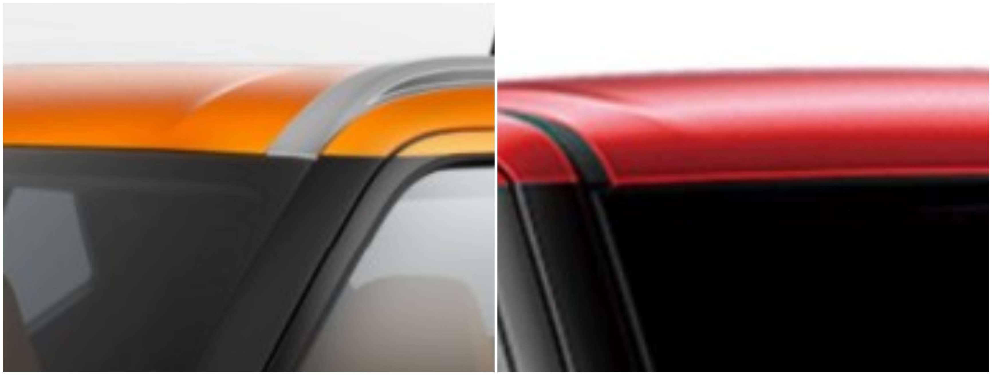
The floating roof is a fascination with almost every automaker ever since the Mini was reborn under BMW in 2000. Whether you are an SUV or an entry-level hatch, you shall sport a floating roof not necessarily because the vehicle’s styling needs it but because my competitor offers one and it’s quite a fad!
Gautam Sen elaborates, “The treatment of the front end, with larger and larger grilles; the tendency to group lamps on two levels, with the indicators and DRL on the higher and headlamps and fog lamps on the lower; the tendency to have fender bulges, specifically for SUVs and crossovers; current surface treatments with excessive crease lines, etc.”
“In the Indian context, take a look at the Tiago and Altroz from Tata Motors and also the i20 from Hyundai and check if there are others that come close to them. Even Honda, that paragon of so much virtue and delight and promise from just a decade ago seems to have withered away and I always say that good design can be pretty and handsome, but the rest aren’t trying,” comments Adil.
Ivo contends, “This is a vast subject indeed, but the advent of the SUV encompasses the answer to much of this debate: Similar concepts giving similar morphologies from the silhouette to the huge wheels needed to reduce the visual mass of these big cars, while still giving a sporty appearance.”
Is design-led more by the marketers than by the designers?
Xavier politely asserts that “Both are really obliged to deal closely together in my opinion! But marketers need to get ideas from the designers first!”
Adil less politely observes, “Marketers try to influence design within their companies. However, good design needs sensible yet capable people at the helms to try and make everyone in the top management and marketing teams plus product planners to wake up and smell the coffee. Most times they drink the coffee and yet aren’t alert enough to understand why the design teams insist on such a headlamp design or a volume for the passenger cell or the rake of the windscreen and so on and so forth.”
Both Ivo and Gautam say that it depends on the automaker. Good dialogue and mutual respect are crucial to ensure a better design. There has been an excessive dependency on “customer clinics” and feedback from those that reflect current fashion and tastes and rarely can predict future trends and preferences.
There is a fine difference between ‘design’ and ‘styling’. While the former is the art of engineering the latter is more about embellishments. Just like art movements where many artists paint in the same style, the world of vehicle styling is going through a phase of following the same school.
Design has to be ‘free’. New technologies, 3D printing, AI, architectures, electronics and chips will allow this freedom very soon. We will again see the divine differentiations in vehicle design just like in the golden era of the 1960s.
Famous designer Ercole Spada once shared that when he joined design studio Gruppo Bertone, the owner Nuccio Bertone gave him a very simple brief…… “make beautiful cars win races!”


